Art Of Living Website
Duration: One semester internship
Role & Responsibilities:
During my internship at Prima Media, I was responsible for designing a new logo and redesigning the company’s website. Additionally, I designed a book cover as part of my contributions.
Challenges & Learning Experiences:
The original website suffered from poor layout, lack of alignment, and no clear use of color theory, making it visually inconsistent and difficult to navigate. A key lesson I learned was the importance of documenting progress with before-and-after screenshots—a step I missed but will prioritize in future projects.
Working on the website redesign, I gained insight into the specific needs of blogging platforms—such as creating layouts that showcase blog posts clearly and engagingly while maintaining easy navigation. I designed the blog layout to be simple, emphasizing readability and ease of update for the client.
Resource Constraints:
I worked with limited resources, including a scarcity of high-quality images like book covers and minimal content from the employer. This required careful planning to use available materials efficiently, ensuring the website remained visually appealing without compromising quality. I also improved my communication skills by actively following up with the employer to gather necessary information, which helped me deliver a more complete and polished project.
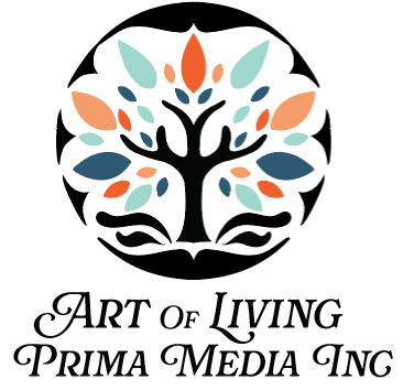
Logo Redesign:
The previous logo had excessive detail in the tipple, making it overly complex and less memorable. My redesign introduced a cleaner color structure and hierarchy, simplifying the design to improve brand recognition and visual impact. The new logo balances detail with clarity, enhancing the company’s professional image.
Website Redesign:
Given the company’s limited budget and the need for a user-friendly site accessible to older users, I avoided complex features like fancy carousels. Instead, I created a simple, clean layout focused on ease of navigation and updating — particularly for adding new book covers. The design emphasizes:
- User friendliness: intuitive structure that anyone can navigate.
- Accessibility: clear typography and straightforward menus for all users.
- Visual cohesion & Showcase: consistent colors and alignment to enhance the professional feel.
Objective:
- Recreate the company logo with improved clarity and structure.
- Redesign the website to be visually appealing, easy to use, and easy to maintain on a budget.
- Design a compelling book cover aligned with the brand’s identity.
Outcome:
This internship strengthened my skills in logo design, website hierarchy, accessibility, and content layout. I also learned to work effectively within real-world constraints such as limited budgets, scarce resources, and minimal client input. These experiences improved my problem-solving and communication skills, preparing me for future projects with similar challenges.