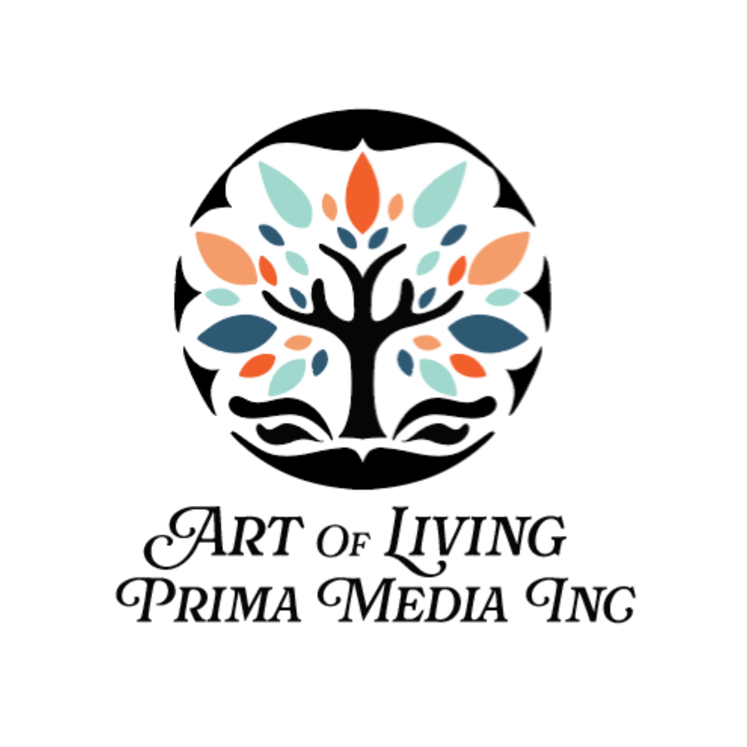
Art of Living – Prima Media Logo Design
Objective:
Design a logo for Art of Living – Prima Media, a book publishing company founded by Italian author and book creator Mari Liberatti. The client envisioned a vibrant, rounded design that symbolized “life” and reflected the company’s focus on cooking, travel, gardening, and teen life publications.
Challenge:
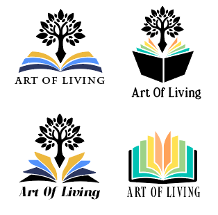
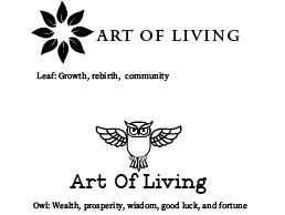
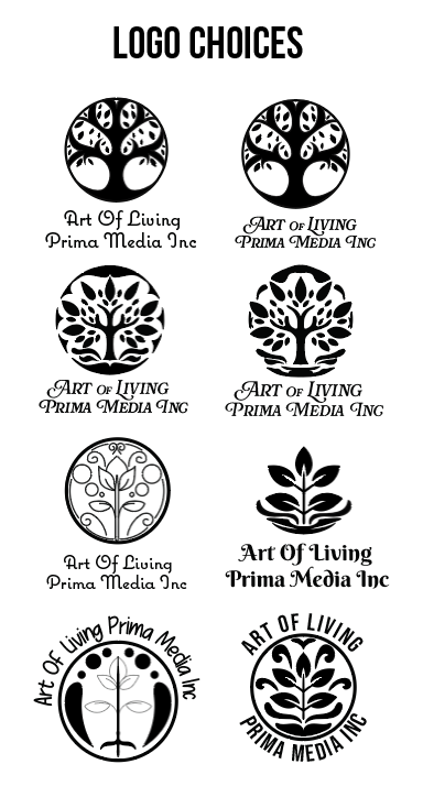
The biggest challenge was translating Mari’s many ideas into a clear visual direction. She had a lot of creative input, but articulating exactly what she wanted took time and interpretation. The design process involved refining concepts through multiple iterations to capture her vision while maintaining a clean, professional identity.
Design Decisions:
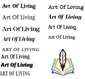
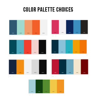
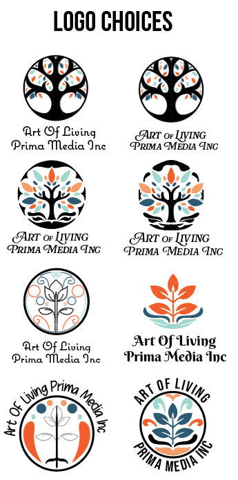
To express the vitality of life, I used a vibrant color palette that conveyed warmth and energy. The rounded shape symbolized wholeness and continuity — a nod to the circular rhythm of living and learning. The font choice was especially important: I selected a typeface that feels lively and fun, yet maintains an elegant tone. This balance helped the logo feel both joyful and refined — perfect for a lifestyle-focused publishing brand.
Outcome:
The final logo met the client’s expectations and was successfully used across the brand’s print and digital platforms. It helped unify the brand identity for Prima Media’s diverse publishing categories and made a strong, welcoming impression to readers and collaborators alike.